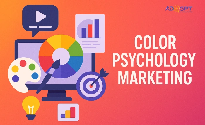
Every color tells a story, and in marketing, those stories can shape buying decisions, brand loyalty, and even revenue. Whether it’s the bold red of a clearance banner or the calming blue of a tech brand’s homepage, colors carry powerful psychological messages. They influence how people feel about your brand before they even read a single word. When used strategically, color psychology marketing can turn casual browsers into loyal customers, simply by evoking the right emotional response at the right time. That’s why the smartest marketers don’t just pick colors, they plan them with purpose.
In a hurry? Listen to the blog instead!
What Is Color Psychology in Marketing?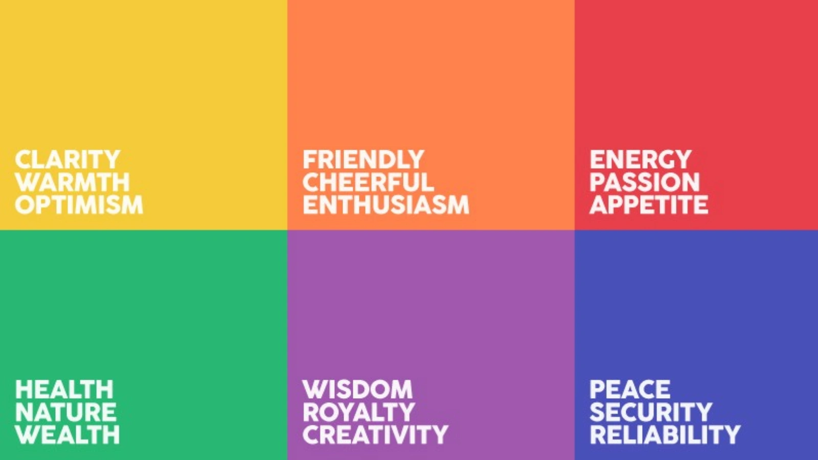
Color psychology in marketing refers to the strategic use of colors to trigger emotional responses and influence consumer behavior. Each color carries a set of associations. Red can signal urgency or excitement. Blue often conveys trust and reliability. Green reflects nature, growth, or sustainability.
Marketing color psychology connects visual elements with brand messaging. Businesses that apply color with purpose don’t just stand out, they connect deeper with their audience.
The Science Behind Marketing Color Psychology
Research indicates that consumers form subconscious impressions of a product in just 90 seconds, and as much as 90% of that perception comes from color alone. This makes color psychology marketing a powerful tool in shaping a brand’s visual identity. Colors influence emotions, memory, and how people interpret messages. For example, warm, bold tones can trigger excitement and urgency, while cooler hues tend to inspire trust and professionalism. One reason tech brands often lean toward blue, that fast-food chains opt for vibrant reds and yellows.
Businesses can explore the Facebook Ads Library to see how competitors use color psychology in their ad creatives, gaining inspiration for their own campaigns.
Why Marketing Color Psychology Is Crucial for Branding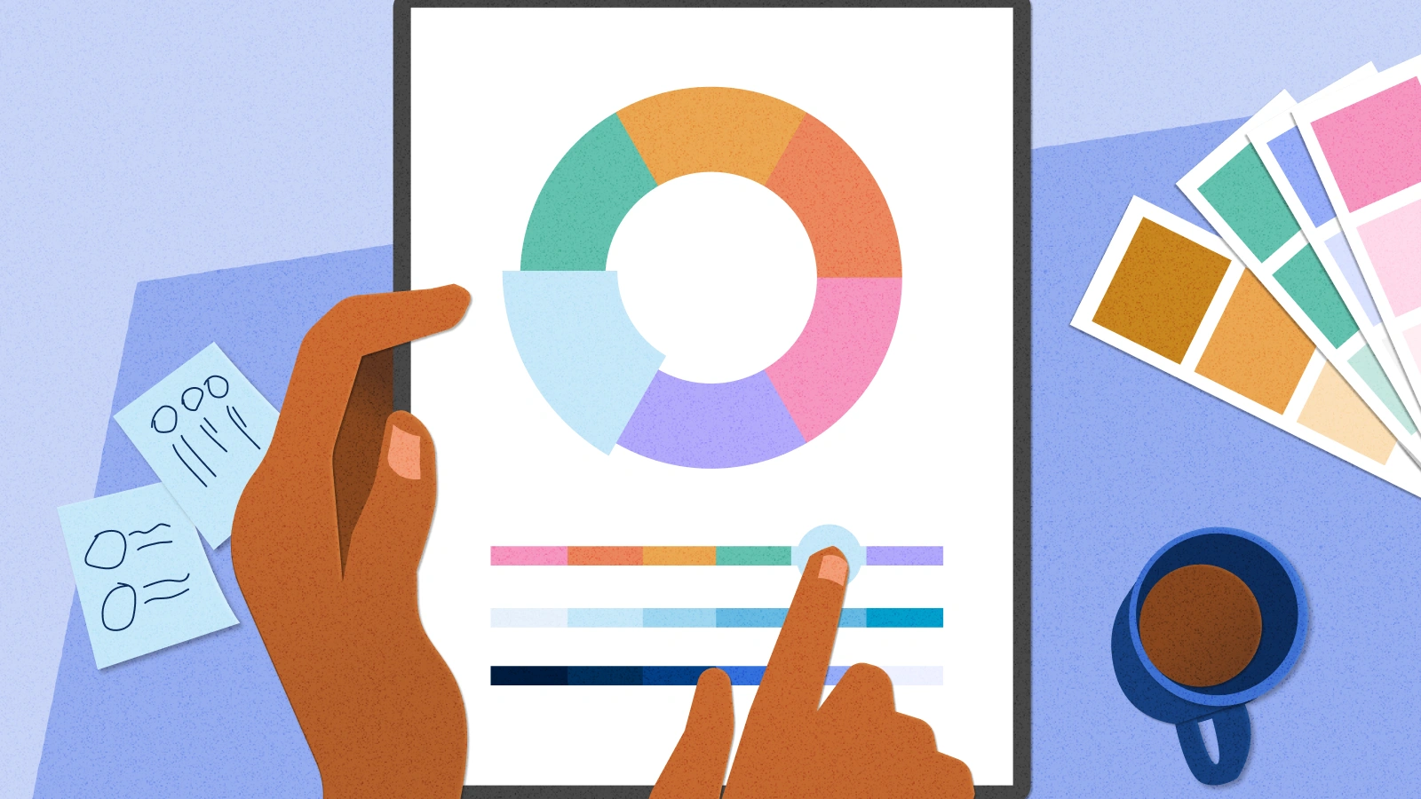
The right color strategy strengthens recognition and customer loyalty. For example, Coca-Cola owns red. Facebook owns blue. These choices weren’t random. They align with the emotion the brand wants to evoke.
A consistent color palette across ads, websites, packaging, and social media builds a recognizable and trustworthy brand image. That’s why marketing color psychology isn’t optional; it’s essential.
Psychology of Color in Marketing: What Each Color Means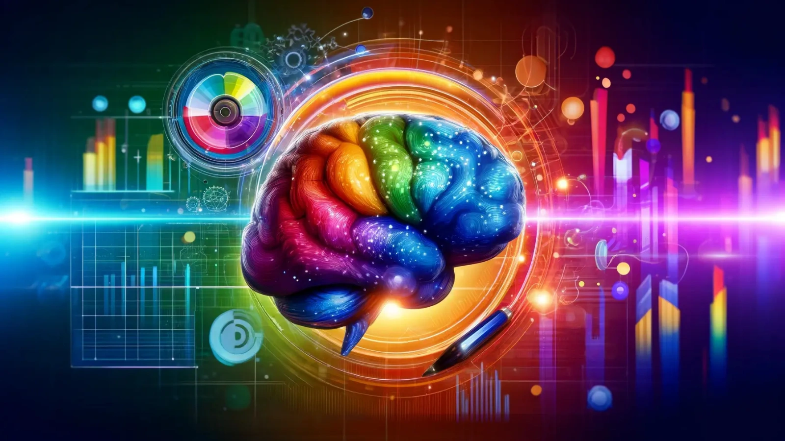
Colors aren’t just visual elements; they’re emotional triggers. When used correctly, they can influence how people feel, think, and act toward your brand. Let’s break down the meaning behind each color and how you can use them in your marketing strategy.
Red – Passion, Urgency, Power, Appetite
Red grabs attention faster than any other color. It’s bold, energetic, and impossible to ignore. This color often sparks excitement and urgency, which is why it’s commonly used for flash sales, clearance tags, and call-to-action buttons. In the food industry, red is a favorite because it can increase appetite and stimulate desire. When your goal is to create high energy or encourage quick action, red is a powerful choice.
Blue – Trust, Professionalism, Calm, Intelligence
Blue has a calming effect, conveying stability and reliability. It’s a color often used by banks, tech companies, and healthcare brands because it builds a sense of security. It tells the audience that your business is dependable and serious. Blue also symbolizes intelligence, making it a great option for brands that want to come across as knowledgeable and credible.
Purple – Creativity, Luxury, Mystery
Purple blends the energy of red and the calm of blue, resulting in a color associated with imagination and depth. Historically tied to royalty and luxury, purple gives off an aura of exclusivity and sophistication. It’s often used by beauty, tech, and lifestyle brands that want to present themselves as innovative, premium, or mysterious.
Black – Sophistication, Authority, Elegance
Black symbolizes strength, formality, and timeless elegance. It works well for luxury products and brands that want to project authority and seriousness. Whether it’s a high-end fashion label or a premium tech product, black communicates exclusivity. It’s best used for minimalist designs and to create strong visual contrast.
White – Purity, Cleanliness, Simplicity
White creates a sense of space, clarity, and simplicity. It’s often used by brands that want to convey honesty, minimalism, or cleanliness, common in healthcare, skincare, and modern tech designs. White also allows other design elements to stand out, making it ideal for clean, uncluttered layouts and user-friendly experiences.
Understanding color psychology marketing helps you make more intentional design decisions. By aligning your brand colors with the emotional tone of your message through color psychology marketing, you create a more consistent and impactful experience for your audience. Every color carries meaning; your job is to choose the one that speaks directly to your customers’ feelings and expectations.
Read More!
AI In Advertising Psychology: Latest Marketing Strategies
Color Psychology In Marketing: Examples from Top Brands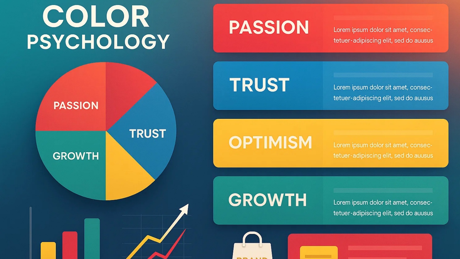
Top brands use color not just to look good, but to shape how people feel and respond. Here are real-world examples of how color psychology marketing creates emotional connections and strengthens brand identity.
McDonald’s: Red and Yellow for Hunger and Urgency
McDonald’s uses red to stimulate appetite and yellow to promote happiness and quick action. This color pairing creates a sense of excitement that encourages fast decisions, especially in high-traffic areas. It’s a perfect match for a brand built on speed and satisfaction.
Facebook: Blue for Trust and Calm
Blue fosters feelings of trust, calm, and communication, exactly what Facebook wants users to experience on its platform. The color helps reduce friction and supports a safe, stable environment for sharing and connecting with others. It reinforces reliability in a space where personal data is central.
Starbucks: Green for Growth and Balance
Green symbolizes nature, balance, and wellness values that align with Starbucks’ brand promise. From ethically sourced coffee to relaxing store designs, Green supports their mission of community and environmental care. It also enhances the calming vibe of their café experience.
Tiffany & Co.: Blue for Luxury and Exclusivity
Tiffany’s iconic blue evokes elegance, sophistication, and timeless romance. The color has become synonymous with upscale gifting and unforgettable moments. Its uniqueness adds a premium feel that enhances perceived value without saying a word.
These examples prove how color psychology in marketing does more than guide design it defines how people see, feel, and remember a brand.
Read More!
How To Use Facebook Ads Library For Ad Creation Inspiration?
How To Choose the Right Colors for Your Brand Strategy
Start by identifying your brand’s core values and target audience. Then match those with the emotions you want to evoke:
- Selling luxury? Consider black or purple.
- Need to build trust? Stick to blue tones.
- Launching a wellness product? Lean into greens and neutrals.
Once you have a direction, test variations. Use A/B testing to see what resonates with your audience. Color preferences can vary by culture, age group, and product type.
Where AI Fits In for Color Palette Optimization
Instead of manually guessing or relying on personal preference, AI tools can analyze audience behavior, industry trends, and competitor strategies to recommend color palettes most likely to engage your target market. These systems can simulate audience responses, predict performance, and even adjust hues for different platforms, helping you save time and ensure data, not just intuition, backs every color choice.
How AdsGPT Helps You Use Color Psychology In Marketing
AdsGPT transforms color psychology marketing from a guessing game into a data-backed, results-driven strategy. Instead of relying on personal preference or trial-and-error, AdsGPT enables you to design ads that align with emotional triggers, platform standards, and competitive insights, all in just a few clicks.
Using AdsGPT to Leverage Competitors’ Color Strategies
With AdsGPT, you can analyze the color schemes used in your competitors’ high-performing ad creatives. By combining this with market trend analysis and real-time engagement data, you can identify which color palettes resonate most with your target audience. From there, you can replicate successful strategies, adjust them to your branding, and create fresh, performance-focused ads that stand out in your niche.
This process allows you to:
- Research best-performing colors for your industry using AI-powered analytics.
- Extract palette inspiration directly from competitor ads without copying their exact designs.
- Test variations to see how different hues influence click-through rates, conversions, and brand recall.
Here’s how AdsGPT empowers you to use color psychology with precision and creativity:
- Ad Creatives Made Effortless
Generate stunning, on-brand ad visuals in seconds, no design skills needed. Every output is professionally styled, aligned to your brand identity, and optimized for emotional impact. - Platform-Specific Customization
Build platform-ready creatives for Meta, Google, LinkedIn, Pinterest, and more, each perfectly sized and formatted for optimal placement and performance. - Start With Existing Ad
Select a competitor’s ad as inspiration and let AdsGPT create a unique, color-optimized version with your tone, message, and logo, instantly making it your own. - Ready-to-Post Creatives
Get fully customized visuals that are immediately ready for publishing—designed for maximum engagement right out of the gate. - Generate Multiple Creatives at Once
Produce up to five scroll-stopping variations in one go for faster experimentation and A/B testing. - Prompt to Personalize
Add a short creative brief to guide the style, tone, and mood—ensuring every visual feels fresh and uniquely brand-aligned. - Smart Brand Memory
Store your logo, tagline, and color palette once, and AdsGPT automatically applies them across every generated creative for consistency and recognition. - Competitor-Inspired AI Ads
Enter a competitor’s name, and AdsGPT will design a visually compelling ad that draws inspiration from them while ensuring the final result highlights your unique value.

Why It Works
With AdsGPT, you’re not just creating ads; you’re combining color psychology, competitive intelligence, and AI-powered creativity to design campaigns that resonate emotionally and perform strategically. By analyzing what works for others, adapting it to your brand, and optimizing based on data, you can consistently deliver visuals that engage, convert, and leave a lasting impression.
Color Psychology In Digital Marketing nd Ads
Colors impact how users engage with your ads online. A bold call-to-action in red might increase clicks. A soft blue background may improve time-on-page. Every design choice changes user behavior.
Digital ads need to grab attention fast. That’s why color psychology marketing plays a big role in your CTR, bounce rate, and even your ROI.
AdsGPT makes it easy to experiment with color variations and track which versions deliver results.
Final Tips
Use color as a tool, not just decoration. Apply consistent branding across platforms, and think about the feeling each hue delivers. Choose contrast carefully. Test frequently. And most of all, understand your audience.
Color psychology marketing delivers powerful results when done right. From emotional branding to higher conversions, the right palette changes everything.
And with tools like AdsGPT, marketers can apply color psychology with precision, speed, and strategy, no guesswork required.
FAQs
1. Does culture affect the effectiveness of color psychology marketing?
Yes. Different cultures interpret colors differently. For example, white symbolizes purity in Western markets but may represent mourning in some Asian cultures.
2. How can seasonal trends influence brand color choices?
Brands often adapt palettes to seasons—bright hues for summer campaigns, warm tones for autumn, and festive colors during holidays—to boost relatability and engagement.
3. Can color psychology marketing work in B2B industries?
Absolutely. While often associated with consumer products, B2B brands also use color psychology marketing to build trust, authority, and recognition among professional audiences.
4. What role do accessibility guidelines play in choosing brand colors?
Ensuring contrast and readability is crucial. Accessible color schemes make designs more inclusive and expand reach to a wider audience.
5. How do brands measure the ROI of color choices in campaigns?
By tracking engagement metrics like click-through rates, conversions, and customer retention, businesses can see how specific color strategies influence performance.

